Friday 20 November 2020

TRENDS in PHOTOGRAPHY: Feng MENGBO (P.R.China)

Feng Mengbo (1966) is a young Chinese artist who lives and works in Beijing. His work combines his experiences as a child of the Cultural Revolution with contemporary Western technology and the visual language of video games. His interactive CD-ROM ‘Taking Mt. Doom by Strategy’ mixes the video game ‘Doom’ with images from the Chinese revolutionary opera ‘Taking Tiger Mountain by Strategy’.
Feng Mengbo at the DOCUMENTA of 1997 in Kassel, Germany
'My Private Album. 1996'
Interactive installation
Kulturbahnhof

The original idea was to build an archive of photos and audio recordings of his family. Soon he realized, that it does not only belong to him but to all Chinese families. Nevertheless, he still liked give the work the title "My Private Album." (From the artist's video channel)

Feng Mengbo Veenman drukkers Open Borders Open Minds

this work was used by CIRCLE-24 for an advertising campaign 'Open Borders, Open Minds' of VEENMAN DRUKKERS (NL) 


---


BIOGRAPHY


Feng Mengbo
Address: Xinyuanjie 51-2-201
Beijing 100027, P. R. China

Education

1966 born in Beijing
1985 graduated from the Design Department of the Beijing School of Arts & Graft
1991 graduated from the Printmaking Department of the Central Academy of Fine
Arts, Beijing


Exhibitions

Solo
1994 'Game Over: Long March', Hanart TZ Gallery, Hong Kong

Group
1992 Art Asia, Hong Kong
1993 China's New Art, Post-1989, Hong Kong Arts Festival and Taipei
1993 Mao Goes Pop, Melbourne, Australia
1993 the 45th Venice Biennial, Italy
1994 New Art From China, Post-19889, Marlborough Gallery, London
1995 Visions of Happiness (Ten Asian Contemporary Artists), Tokyo, Japan
1995 Configura 2 (Dialogue of Culture), Erfurt, Germany
1995 Kwangju Biennale, Kwangju, Korea
1995 Des del Pais del Centre: Avantguardes Artistiques Xineses, Centre d' Art
SantaMonica, Barcelona, Spain
1995 Der Abschied Von Der Ideologie, Hamburg Culturbehorde, Germany


Marc POSCH Design Studio (USA & Germany)

Marc Posch was born in Zürich/Switzerland and grew up in southern Germany. After graduating from the world renowned Merz Art Academy in Stuttgart/ Germany he relocated to Munich where he worked for advertising agencies as a freelance art director and illustrator. The Marc Posch Design Studio was founded in 1980 and became highly successful with a reputation for hip and trendy designs focusing on young peoples interest. Marc and his studio do not only create commercial designs for numerous magazines like Stern, Focus or Der Spiegel, and advertising for what reads like the Who's Who in the German economy, but also for social and cultural events like the Pop Music World Tour "Rock'n Deutsch" for the Goethe Institut, the cultural division of the German State Department. "My intention was always to create something unique, a design with a character even if it looks strange or wild or even chaotic". The Marc Posch Design Studio is now located in Southern California and the claim ‘Design in Progress’ is an expression for communication in the times of Internet and multimedia. It's a synonym for the dynamic process that has changed the structures of traditional advertising and design. (Publications: ABC für Computerdesigner, 1994, Bruckmann Verlag München, Computer & Design, 1995, Bruckmann Verlag München, various articles) Marc Posch Design
TRENDS in PHOTOGRAPHY: Marc POSCH
Marc Posch opuscreativegroup.com

TRENDS in PHOTOGRAPHY: OCCHIOMAGICO (Italy)

TRENDS in PHOTOGRAPHY: OCCHIOMAGICO (Italy)
In 1971 photo studio Occhiomagico (‘the magic eye’) is established, a name which will later become the pseudonym of one of its founders, Giancarlo Maiocchi. In the following eight years 'Occhiomagico' occupied himself with expressive research through the elimination of the traditional visual codes and criteria of the photographic medium.

From the start Occhiomagico characterises himself by activity in two different directions: a professional publishing company (for which he receives several awards) and a constant, intense, artistic research. During all this time, he is extensively followed and documented by critics, who bear witness of small movements and big changes in an artistic investigation with ever more profundity.

From 1979 till 1984 Occhiomagico cooperates with multimedia groups like Studio Alchemia, with architects Aldo Rossi, Allessandro Mendini and Ettore Sotssass Jr., and with the band Matra Bazar of which he is the artistic leader.

The big international break-through came in 1985-1988. In fact, at that time, Occhiomagico was leading several productions in Italy and abroad (Paris, New York, Rotterdam, Memphis and Salonikki are the most important cities) where photography, design, art and music mingle in an utopic scenario. In 1989 there is an important change in his work, because the intimacy of the human being becomes the prime subject of the art and illusion of Occhiomagico. Photography becomes more and more a magical instrument to express and control great fears. Magic, myth and photography meet, research proceeds.

"The Human Condition"
The man, alone, in front of the universe tries to win his fear,
He is assailed with fear every time a star falls.
The man, with other men, tries to keep peace and is assailed with war.

Giancarlo Maiocchi


www.occhiomagico.com

“Photo-designers’ have no future!”, a critical speech by Urs Schwerzmann (Germany)

“Photo-designers’ have no future!”,
a critical speech by Urs Schwerzmann, art-director, held at a professional symposium in 1992 in Frankfurt, Germany.

"Images start in your head; image-makers have to define new image contents."

Several announcements on the radio, television and in the papers during the last 3 weeks. A notice about Mannheim clinic in the evening program of local television. They introduced a new x-ray camera installed with funding from the EEC. Instead of the old method, patients are now scanned digitally, so they are less exposed to radiation. The images are immediately available, only the ones that are used are being filed. Benefit for the clinic: faster, better and more economic.

Newspaper and Science
Production (in baroque-style) with Sony has led to a shorter life of the production. Usually Sony needs 6 months for developing the products, production takes 3 months and it is sold for only a few months.

ARD entertainment evening program.
In “Showvenster” schlager composer Michael Cretou told how he makes his world-wide hits in his studio on Ibiza. In his home studio he mixes all ingredients from his archive. He makes new compositions, leaves something out, adds some string-music or voices and a new hit is born. Without any help of life musicians. Copies from the archives and (mixing-tables) replace musicians and the recording studio.

New values
After the spectacular fall of the DDR and of the entire communistic regime and the have and have not in today’s society, search for a new ideology becomes a matter of survival. Although we are always short of time now, time will be largely at hand in the future. We will not only work to earn money but also to fill time. Work, as we know it today, will become something precious. Because of rationalisations in electronics, labour, as we know it today, will gradually be taken over by machines. Work instead of 'must do something' will become 'can do something'.

Where do the images come from?
Are these events without meaning for photographers? Or are they perhaps indications to an era of changing communications? Like e.g. the production of images.
What will happen or has happened already? Up till now a image was produced ‘live’, the future will be all about filing images. The prospects are already known:
1. the archives are more than full, everything has already been photographed
2. technology, equipment and operators are available
3. environment and economics will force us to do so.

To photograph images and sets ‘life’ will no longer be economic because of these facts:
1. shorter life cycle of the products.
2. the expenses are higher than the earnings
3. technology is available to do it another way.

New products are designed on computers, new worlds can easily be simulated and experienced on a monitor.
Example: kitchens will no longer be photographed but simulated 3-dimensionally on the computer. The client enters his new kitchen, tests work situations, tests his work environment, choose colours worktable surface and everything else. After he has chosen for his new kitchen, which he has just experienced, almost for real, the computer orders everything including (building)plans. And that is that!

Cyberspace on the point of sale, today possible, common tomorrow. This means that constructors, consumers and the production are developing a new product all at the same time! Decisions like surroundings, images and motives are simulated in the computer. Advertising as we know it today, will no longer be necessary in the future.

Press photography for example, a report on the Europa cup finals is shot with electronic camera’s. Individual camera’s are permanently pointed at each of the 22 players. The digital images are being filtered by a computer program that directs, and at the same time sent to the media. There the images are being selected, manufactured in the “real time”.

Who is paying?
Imagine the following: A postorder firm has its summer catalogue photographed in Miami. At the same time television commercials and adverts are produced for all sorts of media. A production of more than a million starts. Absolute madness and a very high risk.
The following scenario could present itself in the future; products could be designed in a artificial way (on a screen). All images used for adverbs are also filed in a low resolution. Assuming that a catalogue would be made in the normal way which means environmental and too expensive paper then the products will only be manufactured the moment the customer orders them.

‘Just in time’ is an understanding in electronics, when used for development, logistics and preparation, slowly but certainly becomes reality. ‘Just in time’ or ‘time compressing’, or whatever you call it, the purpose is the same: development, production, commerce, consuming, to lower the costs and increase the profit. Where do photographers stand in this game?
Pressure increases, The client is under pressure, so the photographer is under pressure. But why?
Production sites are far too expensive. Production cycle gets shorter. Development get faster. Pressure changes the relations. Also the relation towards the client, will change communications.
First just as an instrument of the internal and business communications, but that gives the client all means to restructure and organise their way of communication.
For those who are dependent on the production it is good to know that besides the making, also the marketing and advertising will change. The real advantages for the producers are: a better environment, quality of life and labour market. Enterprises will have a better understanding of national income than a lot of us do nowadays. Otherwise said; the future is more complex than we think. Money will keep its value but that is only one thing. First the EEC acts as a stage, shortly after that comes Eastern Europe, Africa, South America and later on the whole world. Pressure on the client will be passed on to the suppliers whether they are creative or not.

Position/Stand
This will be relevant in two ways: on one side the physically feasible, the geographical homeland, on the other side the psychologically opponent, the spiritual homeland.

First the geographical stand: this will be a debacle. The EEC, and the opening of the borders (1993) haven’t made things easier. The professional freelance photographer is degraded to a photoshop from around the corner. There is no need of being present any longer, nobody will pay for your travel-expenses although distances will be greater. Nobody will expect you to be present at a briefing, but one should be attainable at all times. These are just two of the many changes that can be solved immediately with the available technique. But the will to invest stops with a lot of people with buying a new fax machine.

The psychologically apparent: Illusionary world, make belief, lies
Every image made on commission for a client, only shows an illusionary world, but exists for real in the imagination of the creator and the client. Dreams are being created. Even at this very moment. Non-existing spaces, feelings etc. nowadays are put together in an image, using sophisticated casting, fascinating lighting and perfect styling are being put together in an image or a photo..
This is completely over.This is one of the reasons why I believe that an illusionary world can be created without help, much cheaper, faster, more efficient, colourful and more perfect. The only difference between today and tomorrow will be that we don’t need a real existing world any longer, but create images made up nowadays with lots of time and money.
Everything needs to be possible. Images are not only made by photographers, together they are the result of : CD’s, art-directors, copywriters, public-relations, marketing, product developments etc.
The guest for photographers as such and his knowledge is no longer in demand.
There is no more reason to commission a photograph in that way. His creativity his other disciplines have been necessary up till now. His experience in location styling and lighting is electronically established for everybody and everywhere available. In the future we have images of all archives per modem at hand. All information of all available images, including light, space, models, accessories, movements, expression etc. Helmut Newton) are recorded in a special program. When creators decide to use the photo style of Newton for a photo of a product X, they will make use of the program “Newton, Helmut”. And the models, lighting and location are put together on the screen in Newton style with the product that is to be promoted. That’s the way Claudia Schiffer, together with Doris Day becomes the ideal model for product XY. All this without copyright in spite of living inheritors, or whether they died in 1832.

Enemies, friends pen pals
The relation between art-directors and photographers (now still friendly because they need and respect each other) becomes a rivalry of competition because of the changes in producing images. The art-director is going to create his own images. So do all the others. Unbelievable? Simply ask your (still) friends, the art-directors. Ask the art-director of Macdonald “How many pictures had you made in 1991”?
“Two, each time a dish, cut out of the background”.
Or how do you explain the attitude of former friends, the laboratories, dependent for years on you and your goodwill ? They invest millions in desktop publishing. Investments they can’t regain from their traditional clients, the photographers. So they try to find new clients, etc. advertising agencies. The laboratories invite them to make their images directly on the computer. An operator earns approx. 250 DM an hour. (or 2.000 DM a day). Of course, printers and service-bureaux offer the same services. And the more there are, the cheaper they will be. In the example of the “new” laboratories ,the new electronic image world becomes the most clear: for art directors a possibility to compose images in a fast and economic way and for photographers a possibility to retouch photographs fast and easy.

The curse of the techniques
The computer (workstation) is just a box, stupid and without any talent. The computer is not a threat for photography, it is just a tool which can be used to optimise images quicker and cheaper. It is not for more creativity, but for a more economic use in a technically orientated world. The real change is when no photographic skills are asked from the operator and his client. At least no craftsmanship or professional qualification.

Is the photographer a victim of fast development or did he just not pay attention or has forgotten that except earning money. also other values count? Shouldn’t he have changed over earlier to techniques? Or has he been completely forgotten by his partners: camera factories, big film companies and laboratories? No! The end of the photographic profession has been present from the beginning. The image of his world is historically determinant. He admires art photography and he believes that he himself is a part of an art movement and furthermore for 90 percent he is just an operator. An operator of a machine which, like all machines has been made abundant because of the introduction of electronics. He hasn’t fully understood that making images is not a cultural relevant process in itself but a mechanical process. Machines have been programmed and photographers have even forgotten to write the programs. They forgot to interfere with progress.

Take for instance the professional organisations they only occupy themselves with questions about copyrights. That is why they were founded (in a time that problems were already to be foreseen). Problems that became even worse because of the electronic image storage and manipulation. They do not does not engage with photography its content and future, but just with photographers and their status. A phenomenon they share with all well known unions with status. They will try to protect photographs and copyright, what’s the use of that. Every image archive offers more and better images, every scanner can copy all these images and every program that does not cost more than 2000 DM can make a new image. The downfall of image archives is near, they all invest hecticly in electronic image transfer and archiving. Are you really just starting to protect your status as a designer, while every other creative person can take over your profession? Try to make better images with a computer, while every computer can make a better image faster and cheaper? Do you think you are the only one who can deliver quality? Forgetting that quality is a changing factor. It could be that no one is asking for quality any more. You can only engage in a discussion about quality when you feel that quality and status are the only goals of the future.
The photographers will appeal to their historically gained right of existence and hardly try to rewrite the philosophy of photography and define a new content, or are they?

What remains is hope, posterity, youth
I don't believe that. Because what I am hoping for, and with that I mean posterity, and experience is historical hocus-pocus. On the one side the art-schools, led by professors and governed from the past. Amazed one is rubbing his eyes, seeing which novelties are demonstrated by youngsters. Style and way of expression, it is immediately clear where it originates. The historical phrases, fashionable trends, the result of the German art-schools, whether a school or a studio. Not a trace of laboratories or research-institutes. On the other hand the skilful youth, fascinated by computers. If the copier was the unifying factor in the portfolios of all the German photographers, now the computer is the guillotine of creativity of this same skilful youth. Instead of being creative themselves, they leave this to the computer. Furthermore they should have foreseen this disastrous development in related professions as designers and architects. In stead of improved technique (new machines make everything far more easy) and a new philosophy ( new enterprises need new goals) we get a pitiful image stuttering; not fit to be seen, not to be printed; lots of noise and no real gain. That or something similar, said our parents about us. So, at least hope remains that they, who will make the images of tomorrow, will unmask my considerations as hair-splitting or the know-it -all of an art-director. Stemming from the inability not being able to photograph like them.

New goals
Who will make photographs in the future, like no one else can? Photography will relocate to muse, it becomes art. With this you should take into consideration that art will be more related to spare-time than with the way we look at art now. Defined in two direction:
1. the historical photography, made by you with motives and by machines as we know them.
2. experimental photography, made by new machines and with new contents
3. my personal expectations: new photography made from a mixture of this all, without regards of machines and subjects leading to a new definition of image making. The creative image-maker of the future. Not just photographers but certainly conceptual thinking 'image-makers. Maybe a few photographers will be included.

And finally
How will it proceed? What needs to be done? This calls for a quote by Ray d 'Emoulin, the personification of Mr. Kodak from Rochester, about Kodak's new project, the Center for Creative Imaging in Maine:" I have to ease the way to our industrial goal, because, when the time arrives for something new, the new is already there. I have to foresee the future. The last thing which we can use now is to say: " I wish we had adapted to electronics at the right moment.

urs@schwerzmann.de

Saturday 14 November 2020

TRENDS in GRAPHIC DESIGN: xSITE (the Netherlands)

(following text is from 1999)
xSITE is an ever-evolving platform of visual communication. At xSITE the individual is universal. Inspired by the cross-cultural make-up of its members, xSITE teams up creative problem-solvers from a variety of disciplines to cater to your particular needs.
At a time when technology is rendering the world closer, xSITE serves as a model of international collaboration where ideas are exchanged to produce attainable visions.
Recognizing the strength in an integrated model, our goal is to combine all services associated with the field of design, advertising, marketing and communications. Through a worldwide network, xSITE is dedicated to a collaborative, collective creative process, finding new standards, how we want to visualize our high-tech communication environment.

The places where we meet and communicate are basically in our studio in New York City and our studio in Amsterdam and in cyberspace. The innovations in the field of communication, the internet, has shortened the distance between us and files are send back and forth to complete or intensify the projects.

The basic idea is that each member brings in his or her individual approach, qualities and style and want to share this with others to enhance ideas.

The aims are to improve and expand the idea of a greater understanding between people everywhere, and to contribute towards a better solution of social, cultural, economical and environmental problems, as the basic force behind the organization. xSITE is an interdisciplinary, cross-cultural design organization. The idea of a loose working environment of creative forces around the globe became interesting as people moved ideally closer together, and communication with each other became an easy access of today’s life. Advances in computer technology created the idea to develop an international creativity resource with professionals around the world, targeting a global clientele. xSITE is connecting a network of professionals around the world, with respect to each other and curiosity for the unexpected. Very individual operating, although in appropriate times united to a specialized team to solve an actual problem. The individuals are in sites on different locations and join to work formations to achieve a fresh, innovative and socially responsible solution. Our task is to provide the right answer to visual communication problems of every kind in every sector of the society.

Ingeborg Bloem
Born in The Netherlands, at 18 she found herself too young to start a study of 5 years and moved around to broaden her outlook. For the next two years she worked and studied English and French in London, Paris, and Greece.
From1984-1989 she studied Graphic Design at De Hogeschool voor de Kunsten, Arnhem, The Netherlands.

After her studies she moved to Amsterdam and worked for almost two years at UNA, were she worked for corporate clients, publishers and cultural events.
Not ready to settle down she moved to New York where she worked at Doublespace, one of the most hip studios at that time. There she met her long-time business partner: Klaus. The two had a magical click from the beginning and rapidly plans came up to start a business together on a global base.

When Ingeborg Bloem decided to go back to Amsterdam (boyfriend...) she started to work at Visser Bay Anders Toscani where she stayed 3 years creating worldwide recognized work like Breda Fotografica.

In the meantime internet developed, making it easy to work across the ocean with Klaus on freelance assignments. The plans they had made earlier, started to take off and Ingeborg decided to leave her job to work as an independent designer.
The two started to work together at different projects and ideas were sent back and forth. International clients like Swatch and Oilily joined them together in New York, Amsterdam and Milan.

TRENDS in GRAPHIC DESIGN: xSITE (the Netherlands)
Ingeborg Bloem won several prestigious awards like the Dutch Art Directors Club, The British Art Directors Club and The Type Directors Club New York. Many international design exhibitions have been of showcase of her work.
www.rijksmuseum.nl

Klaus Kempenaars
Hailing from The Netherlands, Klaus Kempenaars has a colorful experience from different countries.
After his studies at the Kunstgewerbeschule Graz, Austria, he started working at Atelier Neubacher, at the time one of the most creative studios in the country. Around a lively group of artistic people he published a monthly cultural magazine, organized cultural event and perfected the skill of schmoozing and slumming. Ready for the world he moved to London in 1985, where he took a position as junior designer at the design company Minale Tattersfield.

Searching for further challenges he decided to move back to his country of origin, where he started in 1986 as senior designer at Tel Design in The Hague. During this period he flourished and worked mainly on long-term projects in corporate identity for government institutions and international corporations.

Still restless, he moved in summer 1989 to New York to experience the American Way. In New York he was able to start at Doublespace, a graphic design studio with a funky touch. Here he developed a different side of his talent, away from corporate identity towards fashion, cultural and entertainment projects. After six years of committed work, he is now one of the founders of xSITE, an on-line international design collaborative.

From 1997 till 1998 he was asked to head the Swatch lab in Milan as design director for the Fall/Winter Collection 1998/99. Successfully he prepared Swatch for the next millennium with experimental form and materials.
Returning to New York in February 1998 he continued to expand the idea of xSITE.
In the years he won several prestigious awards like the Art Directors Club, The Type Directors Club, The 100 Club - The American Center of Design or the I.D. Magazine Gold Medal to name a few. Work of Klaus Kempenaars has been shown in design exhibitions around the world. Stefan Hengst, graduated in 1991 with an Honors Degree from the College of Fine Arts & Design St. Joost in the Netherlands. Upon graduation, he entered a full time position at design studio UNA in Amsterdam. Here he was involved in prize-winning projects. Not completely satisfied with the way of working, he started his own studio in 1993. He soon had a wide range of clients from various publishing houses, The Dutch National Child Care and different Dutch galleries. Projects ranged from identities, books and catalogues, to annual reports and journals.

Although his business was thriving, he had the strong desire to expand his borders. He decided to move to New York in 1996, where he started to work for two years as a senior designer/art director for World Studio.

Within time he was ready for his own business. He started to join xSITE as a collaborator in 1998. Now he works closely together with Ingeborg Bloem and Klaus Kempenaars on different projects in Europe and the United States.
Stefan Hengst won several awards (such as The Dutch Art Directors Club) and his work has been displayed in The Museum of Modern Arts (Stedelijk Museum) in Amsterdam.

Bispublishers: www.bispublishers.com/brands/ingeborg-bloem-klaus-kempenaars/ (link: 14.11.2020)
TRENDS in GRAPHIC DESIGN: xSITE (the Netherlands)


Bispublishers: 'Branded Protest'  Bispublishers xSite

Friday 13 November 2020

TRENDS in Art PHOTOGRAPHY: Wiestaw ZIELINSKI (Poland)

TRENDS in Art PHOTOGRAPHY: Wiestaw ZIELINSKI (Poland)
Photography, present in our lives, culture and art for over 150 years, has gradually developed into an independent artistic discipline with its own means of expression. The history of photography includes countless photographic styles and techniques, the gum bichromate technique is just one of them.

The gum bichromate technique derives its name from the two components that are used, namely gum Arabic and bichromate of potassium or ammonium. At the turn of the 19th century this technique was extremely successful, perceived as a top sophistication in photography, linking the young photographic art with its older sibling, painting. Many acknowledged artists, like Robert Demechy, Hugo Henneberg, the Hoffmeister brothers, Edward Steichen and Alfred Stieglitz, used it, reaching the point of mastery.
What made gum bichromate so special and interesting for artists with so many other special techniques available? First of all, its beauty, specific texture and mood emanating from the finished photograph, which resembled a painting or a graphic. Secondly, an extraordinary flexibility of the very process of developing a photograph. In this process a specially prepared paper is covered with photosensitive emulsion, consisting of the gum Arabic solution, bichromate of potassium or ammonium, and pigment that provides the picture with a desired colour.
Nearly every inorganic dye such as umber, sienna or soot, can serve as a pigment. A dry emulsion is exposed to ultra-violet rich light and in the exposed areas loses its typical solubility. The process of developing a picture takes place in plain water that dissolves the previously exposed parts of the picture. Since the process of covering the emulsion usually needs to be repeated several times, gum bichromate is a manual technique, allowing for vast interference during the creation of a picture, especially in terms of using colours. As such, it is suitable for people with patience and a well-developed aesthetic taste. I strongly believe that a big advantage of gum bichromate is its uniqueness. Every subsequent photograph made from the same negative will differ in colour, contrast or texture, therefore every picture is unique. Another advantage lies in durability of a picture, practically lasting as long as the paper used in the process.
Gum bichromate was actually abandoned in the late thirties due to new trends in photography, reportage for instance, which required improved photographic materials. It seemed that the gum bichromate process was nothing but history, never to be repeated. Yet quite the contrary happened to this technique, through its revival in many European countries and in the USA. It is probably due to the surfeit of all kinds of automatisation in photography and mawkish, sugary and patterned colours available in minilabs, nowadays so popular all over the world.
Effects similar to those created in the gum bichromate technique can be achieved by means of a new method, called Photogravure, in which polymers are used. This method is described in a book published in Denmark by Borgen. A description of the traditional gum bichromate process can be found in THE KEEPERS OF LIGHT by William Crawford, published in the USA in 1979 by MORGAN.
As it has already been mentioned, for over 150 years in the history of photography various special photographic techniques were used, for instance bromine oil, Izohelia, platinum etc. and it is not possible to describe them all in just a few words. There also arised many trends that treated photography as means of artistic expression.

As for Poland, one can actually encounter here a reflection of the same as in the rest of the world. Generally speaking, one can distinguish a personal documentary trend, artistic photography trend based on FIAP aesthetics, and a trend that can be depicted as vanguard photography. Quite often these trends intermingle, creating new ways of expression that are sometimes outstanding, with a frequent use of computer skills. Technically sophisticated photographs of that kind are often used in advertising as a strong influencing visual stimulus.

Wiestav Mariusz Zielinski

TRENDS in Art PHOTOGRAPHY: Vinod DAVE (USA)

Artist Vinod Dave’s expressive and powerful imagery provides insight into a younger generation of modern Indian art. He studied at the Baroda School, Dave now divides his time between working in New York and in India. He was awarded the prestigious Pollock-Krasner Foundation Fellowship for 1994-95.

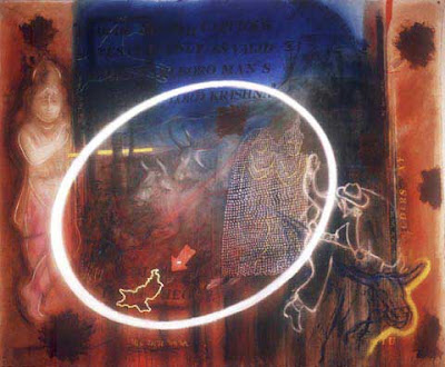
Dave’s work is clearly influenced by the western legacies of pop art and collage. However, the density of elements and layered images derive equally from Indian streets, billboards, and objects of daily life, splashed with colour and iconography.
Part painting, part photography and largely dark toned, his work looks at first like an interestingly abstract pastiche; its figures, at times taken from the news media, provide an allegorical puzzle.
As stated by art critic Kamala Kapoor, “The effect is a chilling glimpse of our agitated age, the inexorable passage of time and of the crumbling of cultural, moral, social, and aesthetic structures that were once taken for granted...” (Bose Pacia Gallery, New York)

Everything about his work - its source of origination, it’s subject, it’s audience - relates to the people of the world. “Their directly shared connection gives my work a strong communicative quality and the potential to become large scale murals in metropolises where all kinds of people from all over the world try to find their own identity”. It is this communicative quality in his art that deems it worthy of the oft-attempted description ‘international’.

Vinod Dave was born in Chital Village, Gujarat, India and now lives in New York, USA. He gained MA in mixed media (painting and photography) with Highest Honours from the Maharaja Sayajirao University, India and the University of South Carolina, USA. His exhibitions include six solo shows in Bombay and New Delhi and he has been represented in museums and art centres in USA, Italy, Germany, the Netherlands and China. Besides teaching art and art history at universities in India and USA, Vinod Dave has received fellowships and awards in recognition of outstanding work in painting, drawing and photography from institutions such as the Asian Cultural Council in New York, the Indian National Academy of Art and the Cultural Fellowship of the government of India.

Vinod Dave has been recognised as one of the leading photographers working with mixed media and his works can be found in the collections of the Indian National Academy of Art, Gujarat State Academy of Art, Punjab University Museum, Max Mueller Center and many private collections.

TRENDS in Art PHOTOGRAPHY: Vinod DAVE (USA)
Part revolution, part ritual

The art of Vinod Dave has at its core the imagery inherent in the popular culture of India, with all of its tensions and contradictions. This tension between opposites permeates the very earth of India’s soil and extends to the most imaginative and fanciful interpretations of heaven ever depicted in any religious pantheon. The infiltration of media, commercialism and consumerism into the ancient, ‘homespun’, indigenous fabric of Indian life is only one of the fascinating contradictions that provide the imagery for Dave’s recent paintings.

Vinod Dave has mastered the techniques of mixed media, combining elements of collage, photography and painting to evoke unique surface textures and luminescence. These formidable skills have never been more beautifully depicted than in the series of new canvases now on view. These paintings are an eloquent expression of Dave’s multiculturalism. They begin in the rural farming villages of Gujarat where the artist photographs posed local villagers dressed in the Navrati theatrical costumes of the Hindu epics, the Ramayana and the Mahabharata. These photographic elements are transferred onto canvas in the bathtub darkroom of his West Village studio. In other paintings, he begins with photographs taken in Manhattan where multi-ethnic New Yorkers wearing Levi’s and Nikes are posed as Hindu saints and deities. These canvases then serve as the backdrop for the final painting and photo-manipulation resulting in exquisite, subtle images that draw the viewer into a twilight world between East and West where all things seem disconcertingly familiar, yet reassuringly foreign.

TRENDS in Studio PHOTOGRAPHY: Tetsuro TAKAI (Japan)


TETSURO TAKAI 1951 - Gifu City, Japan Award winning, Japanese photographer, Tetsuro Takai, is a photographer who has developed his own style for making separations in colour and has kept a genuine Japanese atmosphere in his way of visualising in photography. In 1989 Tetsuro co-founded ZERO a circle of about 20 photographers, graphic designers and publishers who produced group shows and books together. They were all drawn together by an equal desire to contact ‘a variety of questions and anxieties, delights and dreams’ through photography.

“What is significant to me is not something I see but something that lies in between”, he explains.
Sometimes he focuses on abstract themes, and some mere patterns or a haze of colour. He is a commercial photographer specialising in advertisements for jewellery and cosmetics, with assignments for most of the big beauty companies including Estee Lauder and Clarins. They lend themselves perfectly to his style of close-ups, detail, and subdued elegance relying on a lot of play with light and colour.

"Mystique sparkles together with light.
Mysterious figures blend with the darkness. We are poised halfway between these two mysteries. At once alight, then set into darkness.
Here, we hold to the eternal dream of glory.
The existence of objects,
is only ‘existence’ when I sense
a certain relationship between the objects themselves,
or between them and myself."


And this ‘something in between’ is precisely that which I initially consider as the theme of my images. Handling light, shifting objects, always watching and in the light, darkness and air I try to establish something new In my viewfinder, unfamiliar worlds suddenly appear. And they are sometimes fixed on my film forever. Perhaps, the reason I still want to take photographs is that I relish the pleasure of confirming something hazy which always tickles at my heart through photography.

www.kenkyujo.co.jp

TRENDS in Art PHOTOGRAPHY: Taffi ROSEN (Canada)

Passion. That, above all, characterises the work of Canadian photographer Taffi Rosen of Red Head Studios, Toronto. Within little more than a decade she has produced an astonishingly varied body of work that attests unequivocally to her ability to photograph anyone and anything, anywhere and imbue even a seemingly mundane subject with an extraordinary appeal, urgency and vitality. Her photographic images demand to be both seen and experienced. Not surprisingly, her work has appeared in a number of prestigious international exhibitions and publications.
Taffi has been working as a videographer for the past six years, directing videos for classical musicians etc.

Taffi lives lives and works now in NYC
www.taffilaing.photography

TRENDS in Art PHOTOGRAPHY: Taffi ROSEN (Canada)

TRENDS in ART PHOTOGRAPHY Susumo ENDO (Japan)

Juggling contradictions

Susumu Endo's digitally manipulated artworks

The digitally-altered photographs of Susumu Endo juggle innumerable contradictions. Perhaps the first surprise is that, after using the most cutting-edge computer technology, he chooses to print the final image via an offset lithographic process. This is partly due to practical considerations as, Endo feels, the colours this produces are far truer than anything which can be conjured on even the most advanced photo-printer. More important, however, is the psychological reassurance of knowing that the last stage of such an arriviste practice is grounded in a traditional printmaking process over 200 years old.
Endo has spent many years immersing himself in the minutiae of the printing method. One of his series from the 1980's consisted of images produced solely by superimposing layer upon layer of painted dots made from primary colours. He is in no doubt that this served as a vital training for his later use of lithography by giving him an intimate understanding of how the resulting print is formed. It is imperative that at no stage his photographs are reduced to an impersonal mechanical operation - 'the production of a black box' as he calls it. In fact the shortest stage in Endo's whole working process is sitting in front of the computer.
In his most recent print suite, ‘Space & Space’, each scene is created from a single photograph taken after a leisurely stroll through a wooded glade, usually in his native Japan. Before he begins any digital manipulation he has mapped out, in sketch form, several permutations of what the image could look like and only then does he select his final preference. Without sketching Endo feels he would produce nothing. “Younger people”, he says ruefully, “may be able to use computers to play with ideas but, because I am from an older generation, I still think in the form of a sketch” He does enthuse, however, about how technology has liberated the prints he can produce. “I feel that the computer was made just for me” he chuckles and recounts, with no little pride, that he is the only 66-years old he knows who goes anywhere near one, let alone uses the most up-to-date imaging software available.
Further contradictions are revealed as you delve deeper into his ‘Space & Space’ series. Wild, sprawling forest scenes are either penetrated by an alien geometry or bisected by abrupt chromatic shifts. The images play with a fine bal¬ance between unreality and reality. It is a symbiotic relationship in which order is imposed on the natural world, but the natural world refines geometric shapes as well. When this fragile duality is skewed too far one way, the creative tension unravels.
The way in which his prints fuse pulsating colours with a gentle oscillation between light and dark, positive and negative, gives an ethereal, spiritual feel to his work. Endo is at pains to dismiss any obvious link to a Zen theology but there is a meditative air which hints at another form of philosophical reverie He talks about searching for 'a sense of transparency' and 'an aesthetic of silence' which he senses in the films of the Russian director Andrei Tarkovsky. Again there is the contrast, this time between rationalism and lyricism. But then juggling contradictions is what gives Susumu Endo's work its own special quality.

Pryle Behrman in Printmaking Today, summer 2000

www.susumu-endo.com

TRENDS in GRAPHIC DESIGN: STORMHAND


We are both freelance designers and usually work under our own names: Boy Bastiaans and Albert Kiefer. Since 1994 we work together on projects under the name 'Stormhand'. The realms in which we are active are various: interior architecture, advertising, animation and packaging to name a few. For Pepe Jeans in London we designed all 2D as well as 3D projects, as well as the advertisements and brochure. All of them are based on a conceptual approach.

Sometimes we make the photographs ourselves and manipulate them digitally, or a photographer is hired and the photograph is altered in a such a way that it becomes a new autonomous work. Or we may come up with an idea together with the photographer. In which case we won't change the image.

All photographs were made for Pepe’ jeans, London and each picture tells something about jeans, the difference in styles has solely been used as a narrative element.

Roughly, the material can be divided in three categories.
- photographs that have been made with an instant camera.
- technical photographs
- art photographs.

With the first two categories, digital manipulation has been used. The clothes rack, which can be seen in an Osaka street, is an added montage (the rack is not present in Japan). The same goes for the picture with the telephone poles on which the sign has later been rendered. Next to combining 3D-objects in an existing photograph there are two photo’s in which 2D-elements are added. Next to the vending machine in a Japanese shopping mall is a poster which has never been there. Or on the rolling shutters of a shop a text is visible that is manipulated. The two technical photographs, the exploded view and the three domes, were mostly used for advertising. With the exploded view, starting point was to show the ‘ergonomic cut’ and expertise used to put the jeans together. This led to a studio shot of floating separate parts of the jeans, in a way which will show the natural fit on forehand. Basic photography has been done by Bart Oomes.
The three domes made of aluminium, with a mini jeans within, are later really manufactured and used as ‘point of sale’ throughout Europe. In the last category we asked Kim Zwarts, an architectural photographer who really only photographs buildings, to do something with a pair of jeans. Such a cross-pollination works very refreshing and shows work made by an inventive photographer.
www.stormhand.com

TRENDS in GRAPHIC DESIGN: STORMHAND

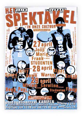
TRENDS in GRAPHIC DESIGN: Studio BOOT

Studio Boot is a collaboration between two designers who met at art school. I forgot to ask what came first: love for each other or for the profession but first Petra was freelancing and later Edwin joined. They have two children now. For the last ten years they mainly work directly for clients in the Netherlands and sometimes for advertising agencies. They are quite certain of their choice not to expand hiring staff apart from the occasional student and living and working in Den Bosch, a provincial town, is clearly preferable to Amsterdam. We discussed Dutch design, which Edwin doesn’t consider typically different. Also, he doesn’t find the topic really interesting to discuss so we talked about preference in client list, for instance they would like to have a publisher or museum or a theatre on their list.

One of their first assignments, the design of the prestigious books of BNO (Dutch Design Union) caused a collision with the design establishment in The Netherlands. The use of Delft’s Blue (traditional Dutch porcelain), as a design motive was not recognised as professional. Some found the concept and design style unsuitable for what should in their opinion be ‘Dutch design’. The design made by Boot would do no justice to the high level of what was established which such great effort. This criticism however, did not have any consequences for the final design. The books are well received and won several awards for BNO, BIS publishers and Studio Boot as well.

Their style is striking because of a conceptual approach and examples of this are aptly published in national and international design publications. Moreover, they gain many awards. This appreciation gives them a lot of publicity; this forms a solid basis and provides feedback possibilities for a fresh approach.

After their training they both experienced the transition to working with computers. Edwin is now teaching at the Design Academy in Eindhoven and Petra at the art school in Den Bosch.

Recently the college duration was shortened from four to three years and this is seen by both as a step back in the quality of education. Edwin thinks that students are less rebellious now than they used to be, more ‘schoolish’ and also less clear in determining their direction and expectation for the future. They seem too be more occupied with themselves and finding their place. But he does think that students are able to look: a culture of images.

A little bit hesitating and laughing is their reaction when we discuss the use of photography in graphic design; they must be aware of the present changes in commercial photography. The photography they use is contracted out, bought from agencies or sometimes done by themselves. Image manipulation in Photoshop is also done by themselves. Important is their illustrative use of photography. Sometimes they may start with stock photography, the next time they will use a well figured approach of studio photography and styling. Adding elements to the image like strong colour, background, text, different pictures or illustrations and again the total of all the elements becomes more than a single photograph.

One eye-catching idea was the design of a Valentine ‘scratch’ stamp for the Dutch Post, millions were printed. By scratching the surface, a hidden message becomes visible addressed to the person who receives the anonymous letter or postcard. This design was very well received; it reached the front pages and was even shown on CNN.

They quite often have to make a difficult choice. Like for instance between the assignment for designing a new stamp or the invitation to be in the judging-committee in New York for the ADC USA; finally they go for the last option. No less than 2000 designs had to be judged in the impossible short time of three days. What one needs than is a fair amount of intuition; approval is simply done by raising hands, most votes count!

One of their recent projects was the design of a special edition of the ‘Libelle’, a large women’s weekly. What would it look like in 2004? This in co-operation with specialists in content and trend (Lidewij Edelkoort, at present director of the Design Academy in Eindhoven and of an agency in Paris). After several attempts by professional photographers, the cover was photographed by themselves, this seemed to be the only way to get the effect they desired. Main subject for an article about food was cabbage, for instance now that article would be about sushi. The change in trend for the near future would among other things be ‘togetherness’, we start to do everything 'together’ again; other trends would be the revival of old values and the stabilisation of the techno revolution. The result in my opinion may look greyish and remarkably non-technical, the response was again quite positive.

Largest assignment on which they are working now is for the government in co-operation with four different agencies.

Their simple wish for the future would be to be able to devote more time to their personal projects. They now publish a poster once a year with a silk printing company in The Netherlands.

Trends in graphic Design Studio BOOT
logo Studio Boot

TRENDS in PHOTOGRAPHY: Sandor BENKOE (Hungary)

TRENDS in PHOTOGRAPHY: Sandor BENKOE (Hungary)
Sandor Benkoe is an international working fashion and advertisement photographer. 1984 he graduated at Johannes Gutenberg Univerity Mainz as visual artist. Since 1992 he works in D-Worms and H-Budapest in the advertisement business and visual arts. He works in his photostudio called artfoto studio, equiped with Broncolor, Sinar and Foba and on location. 1998 he started with digital photography/digital imaging. In the meantime over 80% of his commercial work is done digitaly. He is member of Circle-24, an group of international working and known photographers.

TRENDS in PHOTOGRAPHY: Sam HASKINS (UK)

"I make a strong point of never confusing photography with psychology or literature. That is why I do not dream up explanations of my work and also these photographs are, quite simply - me, thinking pictures."

Remember Barcelona
TRENDS in PHOTOGRAPHY: Sam HASKINS(UK)
TRENDS in PHOTOGRAPHY: Sam HASKINS (UK)
TRENDS in PHOTOGRAPHY: Sam HASKINS(UK)
"Barcelona is a visual carnival. A joy. A place where creative giants roamed. It boasts facets that range from sublime Gothic structures to the most flamboyant fantasies made real by the likes of Antoni Gaudi, Josep Domenech i Montaner, Miro et al - from serene medieval squares to that most exceptional German pavilion designed by Mies van der Rohe for the 1929 Worlds Fair -and neighbourhoods like the Eixample where modernisme flourished. One is left spellbound by the breadth and diversity of it all.

As a rule I do not remember my visual experiences as a series of individual pictures. At the end of a working day in Barcelona my mind is awash with a panoply of imagery where multiple pictorial elements blend and merge. Thus the germ of the montage approach used in some of these photographs was established. Various components combine to reinforce and expand an idea and intrigue the eye, often by virtue of their disparity. The superimposition was achieved by simply sandwiching the transparencies."

Sam Haskins (1926 - 2009)

www.clic.com/sam-haskins

TRENDS in PHOTOGRAPHY: Sabine KORTH (Italy)

SABINE KORTH: -from South to North

Sabine KORTH From South to North

Sabine Korth moves around the world with a light camera and with a map without borders. The camera is a Minox. The map is constructed through her foreign sensibility. She is German, she lives in Italy, and she has traveled to many "exotic" places: Zimbabwe, Egypt, Ghana, Venezuela, Cuba, Turkey, Mexico, and, of course, Europe.

The feeling of lightness and the exclusion of borders are conducive to Sabine's montages: pictures made of sketchy impressions, contained inside a frame that is not a frame, just a pause between stories, which seem interconnected to one another. When she is back home, she makes the montages. She looks at her contacts like a child looks at her toys. She plays with them, she dreams through them, she cuts and pastes her dreams.
Sabine needs to see distant lands because she needs to explore the nature of her dreams. In some cases, these dreams reflect a Northern European fascination with warm climates and luscious nature. But the work is not about that. She does not appropriate the foreign world with a voyeuristic, distant attraction. Her attraction to these sites has something to do with herself. She questions her own identity as she visits the natives who look like her, smile like her, get undressed like her. She becomes part of her world, feeling, for an instant, that hers is "a small world". But the work is not about that either. Sabine does not recognize a universal pattern which helps her to decipher distant lands and people. She feels different from this world, as she perceives the differences inside it.

She sees English advertisements in Africa, tourist shoes dangling on camels, tv screens above the desert landscape, Christian iconography and African dances, military power and artificial gardens, evolution and revolution. She lets the foreign place visit her, and she brings the memory of the visit into her contemporary European awareness. She brings camels to Berlin, Turkish mosques into Germany, African masks in the subway, the Brandeburg's gate by the Pyramids, the African kids by the Berlin wall. She dwells, with dreams and concerns, in the large world without borders, once captured with a small camera.
Antonella Pelizzari


INSIDE HORIZONS
"In front, the camera takes a photograph, behind it cuts out a silhouette of the photographers soul. In front it sees his object, and behind it sees the reason, why this object should be fixed. Shows things and the desire of it."
(Wim Wenders)

Perceptions
Traveling, I collect instants and atmospheres. I'm not really in showing an action, or telling a fact. These are invented images, chosen from a state of mind; often "recognized" images (found as an answer to something that was already there).

Technique
I work with a Minox. This small camera allows me to get close to people, without interrupting the developing of the situation. A sensitive film and the manageable camera allow me to realize my photos in every light condition. I don't feel any technical limitation. In this way the use of the camera becomes simple and natural, like using a pen. Almost feels like an extension of my finger. I use black and white, because it seems abstract to me, and belongs to the imaginary. It is a way of searching the essence of things without stopping at the surface.

Collage
I have travelled to know, to see and to feel. Capturing situations that touch something inside of me, taking photographs becomes secondary. At the beginning there are travel photos and I never think of putting them together in a collage; very photo is complete on it's own.

Printing a small "diary book", I choose the sequence, rediscovering the way the story runs. Then I realise some images talk to each other. It becomes a game, to choose a first and second plain; when putting the photos together I don't start with any purpose but from an inspiration. Following the sensation of a dream and nostalgia for a faraway land.
In collage I found a way to realise more complete and complex images, bringing them even closer to my experience.

The unreal element
After my studies of classic reportage photography, I soon began to avoid realism, and started to tell my own "stories", instead of documenting reality. I'm not looking for a unilateral simple image, but for the ambiguity of photography: another reality, legible only above the frame.

www.fotokorth.de

You may also reach Sabine via www.vintagephotocollage.eu

Sabine Korth photomontages
Sabine Korth fotomontagen
Sabine Korth photomontages

You can also reach Sabine via: www.vintagephotocollage.eu/
 

index photographers & designers

Why this project" -Robert SCHILDER (the Netherlands) | next Digital Reality PHOTOGRAPHY: Achim MOHNÉ (Germany) "Everything ...