Studio Boot is a collaboration between two designers who met at art school. I forgot to ask what came first: love for each other or for the profession but first Petra was freelancing and later Edwin joined. They have two children now. For the last ten years they mainly work directly for clients in the Netherlands and sometimes for advertising agencies.
They are quite certain of their choice not to expand hiring staff apart from the occasional student and living and working in Den Bosch, a provincial town, is clearly preferable to Amsterdam. We discussed Dutch design, which Edwin doesn’t consider typically different. Also, he doesn’t find the topic really interesting to discuss so we talked about preference in client list, for instance they would like to have a publisher or museum or a theatre on their list.
One of their first assignments, the design of the prestigious books of BNO (Dutch Design Union) caused a collision with the design establishment in The Netherlands. The use of Delft’s Blue (traditional Dutch porcelain), as a design motive was not recognised as professional. Some found the concept and design style unsuitable for what should in their opinion be ‘Dutch design’. The design made by Boot would do no justice to the high level of what was established which such great effort. This criticism however, did not have any consequences for the final design. The books are well received and won several awards for BNO, BIS publishers and Studio Boot as well.
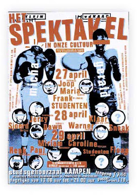
Their style is striking because of a conceptual approach and examples of this are aptly published in national and international design publications. Moreover, they gain many awards. This appreciation gives them a lot of publicity; this forms a solid basis and provides feedback possibilities for a fresh approach.
After their training they both experienced the transition to working with computers. Edwin is now teaching at the Design Academy in Eindhoven and Petra at the art school in Den Bosch.
Recently the college duration was shortened from four to three years and this is seen by both as a step back in the quality of education. Edwin thinks that students are less rebellious now than they used to be, more ‘schoolish’ and also less clear in determining their direction and expectation for the future. They seem too be more occupied with themselves and finding their place. But he does think that students are able to look: a culture of images.
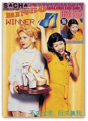
A little bit hesitating and laughing is their reaction when we discuss the use of photography in graphic design; they must be aware of the present changes in commercial photography. The photography they use is contracted out, bought from agencies or sometimes done by themselves. Image manipulation in Photoshop is also done by themselves. Important is their illustrative use of photography. Sometimes they may start with stock photography, the next time they will use a well figured approach of studio photography and styling. Adding elements to the image like strong colour, background, text, different pictures or illustrations and again the total of all the elements becomes more than a single photograph.
One eye-catching idea was the design of a Valentine ‘scratch’ stamp for the Dutch Post, millions were printed. By scratching the surface, a hidden message becomes visible addressed to the person who receives the anonymous letter or postcard. This design was very well received; it reached the front pages and was even shown on CNN.
They quite often have to make a difficult choice. Like for instance between the assignment for designing a new stamp or the invitation to be in the judging-committee in New York for the ADC USA; finally they go for the last option. No less than 2000 designs had to be judged in the impossible short time of three days. What one needs than is a fair amount of intuition; approval is simply done by raising hands, most votes count!
One of their recent projects was the design of a special edition of the ‘Libelle’, a large women’s weekly. What would it look like in 2004? This in co-operation with specialists in content and trend (Lidewij Edelkoort, at present director of the Design Academy in Eindhoven and of an agency in Paris). After several attempts by professional photographers, the cover was photographed by themselves, this seemed to be the only way to get the effect they desired. Main subject for an article about food was cabbage, for instance now that article would be about sushi. The change in trend for the near future would among other things be ‘togetherness’, we start to do everything 'together’ again; other trends would be the revival of old values and the stabilisation of the techno revolution. The result in my opinion may look greyish and remarkably non-technical, the response was again quite positive.
Largest assignment on which they are working now is for the government in co-operation with four different agencies.
Their simple wish for the future would be to be able to devote more time to their personal projects. They now publish a poster once a year with a silk printing company in The Netherlands.
Subscribe to:
Post Comments (Atom)
Why this project" -Robert SCHILDER (the Netherlands)
last | next Why this project? (written in 1994) With this publication, I would like to illustrate the relationship between professional...

-
Circle of 24 photographers NOVEMBER 21 .1995 Dear Robert, Persona ro; Ltd. 325 Soi Kantabutr l. Sukhumvit 63. Bangkok 10110. Thaila...
-
last | next In 1971 photo studio Occhiomagico (‘the magic eye’) is established, a name which will later become the pseudonym of one...
-
Why this project" -Robert SCHILDER (the Netherlands) | next Digital Reality PHOTOGRAPHY: Achim MOHNÉ (Germany) "Everything ...


No comments:
Post a Comment