Showing posts with label trends in graphic design. Show all posts

Friday, 13 November 2020

TRENDS in GRAPHIC DESIGN: STORMHAND


We are both freelance designers and usually work under our own names: Boy Bastiaans and Albert Kiefer. Since 1994 we work together on projects under the name 'Stormhand'. The realms in which we are active are various: interior architecture, advertising, animation and packaging to name a few. For Pepe Jeans in London we designed all 2D as well as 3D projects, as well as the advertisements and brochure. All of them are based on a conceptual approach.

Sometimes we make the photographs ourselves and manipulate them digitally, or a photographer is hired and the photograph is altered in a such a way that it becomes a new autonomous work. Or we may come up with an idea together with the photographer. In which case we won't change the image.

All photographs were made for Pepe’ jeans, London and each picture tells something about jeans, the difference in styles has solely been used as a narrative element.

Roughly, the material can be divided in three categories.
- photographs that have been made with an instant camera.
- technical photographs
- art photographs.

With the first two categories, digital manipulation has been used. The clothes rack, which can be seen in an Osaka street, is an added montage (the rack is not present in Japan). The same goes for the picture with the telephone poles on which the sign has later been rendered. Next to combining 3D-objects in an existing photograph there are two photo’s in which 2D-elements are added. Next to the vending machine in a Japanese shopping mall is a poster which has never been there. Or on the rolling shutters of a shop a text is visible that is manipulated. The two technical photographs, the exploded view and the three domes, were mostly used for advertising. With the exploded view, starting point was to show the ‘ergonomic cut’ and expertise used to put the jeans together. This led to a studio shot of floating separate parts of the jeans, in a way which will show the natural fit on forehand. Basic photography has been done by Bart Oomes.
The three domes made of aluminium, with a mini jeans within, are later really manufactured and used as ‘point of sale’ throughout Europe. In the last category we asked Kim Zwarts, an architectural photographer who really only photographs buildings, to do something with a pair of jeans. Such a cross-pollination works very refreshing and shows work made by an inventive photographer.
www.stormhand.com

TRENDS in GRAPHIC DESIGN: STORMHAND

TRENDS in GRAPHIC DESIGN: Studio BOOT

Studio Boot is a collaboration between two designers who met at art school. I forgot to ask what came first: love for each other or for the profession but first Petra was freelancing and later Edwin joined. They have two children now. For the last ten years they mainly work directly for clients in the Netherlands and sometimes for advertising agencies. They are quite certain of their choice not to expand hiring staff apart from the occasional student and living and working in Den Bosch, a provincial town, is clearly preferable to Amsterdam. We discussed Dutch design, which Edwin doesn’t consider typically different. Also, he doesn’t find the topic really interesting to discuss so we talked about preference in client list, for instance they would like to have a publisher or museum or a theatre on their list.

One of their first assignments, the design of the prestigious books of BNO (Dutch Design Union) caused a collision with the design establishment in The Netherlands. The use of Delft’s Blue (traditional Dutch porcelain), as a design motive was not recognised as professional. Some found the concept and design style unsuitable for what should in their opinion be ‘Dutch design’. The design made by Boot would do no justice to the high level of what was established which such great effort. This criticism however, did not have any consequences for the final design. The books are well received and won several awards for BNO, BIS publishers and Studio Boot as well.

Their style is striking because of a conceptual approach and examples of this are aptly published in national and international design publications. Moreover, they gain many awards. This appreciation gives them a lot of publicity; this forms a solid basis and provides feedback possibilities for a fresh approach.

After their training they both experienced the transition to working with computers. Edwin is now teaching at the Design Academy in Eindhoven and Petra at the art school in Den Bosch.

Recently the college duration was shortened from four to three years and this is seen by both as a step back in the quality of education. Edwin thinks that students are less rebellious now than they used to be, more ‘schoolish’ and also less clear in determining their direction and expectation for the future. They seem too be more occupied with themselves and finding their place. But he does think that students are able to look: a culture of images.

A little bit hesitating and laughing is their reaction when we discuss the use of photography in graphic design; they must be aware of the present changes in commercial photography. The photography they use is contracted out, bought from agencies or sometimes done by themselves. Image manipulation in Photoshop is also done by themselves. Important is their illustrative use of photography. Sometimes they may start with stock photography, the next time they will use a well figured approach of studio photography and styling. Adding elements to the image like strong colour, background, text, different pictures or illustrations and again the total of all the elements becomes more than a single photograph.

One eye-catching idea was the design of a Valentine ‘scratch’ stamp for the Dutch Post, millions were printed. By scratching the surface, a hidden message becomes visible addressed to the person who receives the anonymous letter or postcard. This design was very well received; it reached the front pages and was even shown on CNN.

They quite often have to make a difficult choice. Like for instance between the assignment for designing a new stamp or the invitation to be in the judging-committee in New York for the ADC USA; finally they go for the last option. No less than 2000 designs had to be judged in the impossible short time of three days. What one needs than is a fair amount of intuition; approval is simply done by raising hands, most votes count!

One of their recent projects was the design of a special edition of the ‘Libelle’, a large women’s weekly. What would it look like in 2004? This in co-operation with specialists in content and trend (Lidewij Edelkoort, at present director of the Design Academy in Eindhoven and of an agency in Paris). After several attempts by professional photographers, the cover was photographed by themselves, this seemed to be the only way to get the effect they desired. Main subject for an article about food was cabbage, for instance now that article would be about sushi. The change in trend for the near future would among other things be ‘togetherness’, we start to do everything 'together’ again; other trends would be the revival of old values and the stabilisation of the techno revolution. The result in my opinion may look greyish and remarkably non-technical, the response was again quite positive.

Largest assignment on which they are working now is for the government in co-operation with four different agencies.

Their simple wish for the future would be to be able to devote more time to their personal projects. They now publish a poster once a year with a silk printing company in The Netherlands.

Trends in graphic Design Studio BOOT
logo Studio Boot

Kristian ESSER (the Netherlands)

Kristian ESSER, Digital/Brand Strategist | Public speaker | Brainstorm leader

With a background in communication and connected to the internet since its very beginning, Kristian has developed a natural understanding of communities and uses this as a foundation for his project work. He is often asked to give his opinion on these topics by media companies such as BNR in Holland and Radio24 in Italy. He also shares his thoughts regularly on several blogs, including his own.


Kristian Esser aka 'Mister Harder'

TRENDS: interview with Jan van TOORN (the Netherlands)

R: Jan, the purpose of our conversation is to try to determine new values and tradition of photography.

JvT: That is similar to the question I received last year from a design agency and the art schools in The Hague and Eindhoven (The Netherlands) to give a lecture about image editing. Also at the masters degree course for visual communication in the United States, where I am a couple of times a year, I have noticed a growing interest for this subject from our students. For the last five years, the number of students interested in this type of education is growing who want to change the focus of their research from technology and aesthetics to meaning and analysis. This stems from questions like: “What the hell am I doing?” A feeling of discomfort, which is connected to the mainly decorative and logistic solutions designers are engaged with under pressure of commerce.
The students, who conduct practical and theoretical research at this kind of institutions, have questions about the possibilities of a broader social engagement than a merely commercial one. Being a designer means you add to cultural signification, that may be modest on your own, but design in total makes a heavy mark to the way in which we as consumer look at the world and are engaged with it. And because of this practical experience with producing images, theoretical knowledge and thinking about the role of the image in the media are of great importance. Although the belief in the importance of the word in the dealing with things is fortunately greatly diminished, this does not mean that our visual language has improved. The increase in the use of the photographic image in mass media since the late nineteenth century has, because of the expansion of the information economy, caused a gigantic visual production and this revolution driven by market and technology produces an avalanche of images. But this world-wide culture does not benefit the production of images in a qualitative and opinion building way. The idiom of media languages limits the size and structure of the languages of which we are a part. Languages which map the world in a different way, or languages with a limited use, of which we are also a part, are hardly or not at all used.
Because of this greatest common denominator the versatility of human experience is severely at risk. Former generations have worked hard to find alternatives for such a language dominated by economics. But in practice, only remarkably few people seem to be able to create a more profound grammar of viewing.

In our research at Rode Island School of Design, which you might call something like ‘visual direction’, we try to do something about this. But again and again, it becomes clear how badly informed designers, photographers and other image-makers are and how little experience they have with the possibilities of expression in visual language. This is rooted in the circumstances in which we work. Visual communication makes a living, apart from supplying technological and organisational services, mainly with providing an attractive identity for institutions and their products.
Visual communication serves private and commercial interests, which make merchandise out of knowledge, information and recreation. As a result one notices the decline for instance in The Netherlands and in the United States of a grand documentary imaging tradition, which in its most flourishing years had a broad social support. A fertile soil, which stemmed from the awareness that subjects of mutual interest need a richer and more versatile idiom than the aesthetic rhetoric of publicity.
When we worry about the narrowing of visual languages and ‘the corporate take-over of public expression’ as Herbert Schiller puts it, we will have to look more critically to the circumstances in which we work. A more realistic understanding will lead to a usage of language that will take into account and renew forgotten parts of visual vocabularies.
Because of the situation in the media this is not only a badly needed challenge, but also very possible.

R: Although this publication is dealing with the last decade, I feel that we both think that a lot has changed during the sixties. Do you agree?
JvT: How do you mean?
R: Changes not just in ‘formal’ education, the education with rules about what is allowed and what is not, but I think that at that time there was also a change in the appreciation of photography: we looked at it with much more attention. And what about political meaning, because that has always been very important to you?
JvT: For many designers, photographers, artists and others, the political factor is in politics as subject or political action. For me this is far too short-sighted, a far too narrow vision on the political meaning of artistic or intellectual work. Everything you produce has just like any other human activity political aspects, especially when it is a public activity.
Often, I compare a designer with an actor or a musician. A ‘text’ of a play or piece of music can only come to life with an intriguing interpretation. It is always more than the objectivity of words or notes and it is the same with a photographic or graphic image. In my opinion a classical or conventional interpretation is less interesting than a contrary or progressive interpretation, but both are political. It is important of course on what level you break through existing standards. Furthermore, except content and form there is of course the relation to the viewer, which determines how conservative or radical you are as producer from a political point of view.

R: (while making notes on this interview, he sketches a triangle) There is a photographer, who makes a photograph of a person and there is a person who looks at this photograph. These three people are connected by the same event. When I make your portrait, I do this in a way that reflects how I see you. Then there are my camera and films. I can make a lot of alterations with that. Than there is your opinion, shall I take my glasses off, do I look older, younger, better. And than there is this third person who is of the opinion that Robert has taken a lousy photograph of Jan van Toorn, because this is not how he is at all. A designer says: “I want to take this out of this photograph and make the black more black because that gives more drama” and he crops a picture differently as well. So an awful lot is happening there. Photographers should, but I don’t want to sit on your chair, be much more aware of the possibilities.
JvT: My triangle is a little different and stems from linguistics. The photographic image is so very special because it seems to be equal to what we observe. Roland Barthes calls this a realistic level, which is an analogue to reality, and therefore denotation. At the same instant the image is also connotation, signification by interpretation. Something that happens because of all possible forms of manipulation, which take place consciously or unconsciously at both levels.
The language of photography seems independent, but it has a long tradition. Centuries of art preceded, and lets not forget theatre, later cinema, television, etc. Also literature, scientific knowledge and philosophy have a great influence, just as social circumstances, technology and so on. The things you recognise in a photographic image, those which you share with others, are elements of denotation as well as elements of connotation. But how you use these shared conventions of the photographic language is what makes it really interesting. Manipulation is hard to deny as it has been in the design world for a very long time, just as with the photographers of New Realism for instance, who pursued objectivity as strictly as possible. Next to this exists an artistic tradition appealing more to a subversive, subjective intercourse with conventions about style and contents. That changed in the late fifties, beginning of the sixties. Then again it became clear that the tension between the two elements, realistic imitation and conscious artificiality, is important to escape the illusions of the accepted, classical representation. It will be difficult to find any remains of that in the media now. The rise of mass-media and mass consumption in the sixties caused a visual language that developed first of all sideways. Meaning, it caused a large variety of fascinating, largely decorative dialects. Reference and interpretation remain restricted to a constant renewal of style.

R: And a part of all this is who you are and where you come from. What are your roots and what kind of training did you get? Could you say something more about education?
My training for instance was solely about films, light and cameras. Education abroad, for instance in America is quite different, is it not? JvT: Not as a general rule, but you could say that in art education in English speaking countries there is more emphasis on transferring skills and knowledge of visual traditions. There is an education in theory and practise, which extends from cultural studies and communication studies to vocational training and knowledge and experience with technology. Education in The Netherlands is much less rooted in a broader cultural framework, is hardly critical and didactically underdeveloped. It is first of all aimed at the development of mentality of the individual student. How this mentality is expressed and what a visual grammar could be more than usual are in most cases left to coincidence. The same applies to editorial methodology and dealing with public.

R: And why is that not the same in The Netherlands?
JvT: Our art schools have a pragmatic and aesthetic background. In The Netherlands a programmatic approach is rare. And it didn’t get any better after twenty years of retrenchment. We tried a different approach at the Rietveld Academy. And that was reasonably successful, but it is a pity it didn’t get any further than a prolonged incident. At that time I was appointed by Charles Jongejans and Tom de Heus with a brief called ‘direction and planning’. I learned an awful lot there; tried to accomplish together with my students that what I had so dearly missed in my own education: how to design with a more journalistic approach of visual communication. Of course, without forgetting what we already accomplished.

R: Can you tell something about the symposium ‘Design beyond design’ in Maastricht?
JvT: The Jan van Eyk Academy is a post-graduate workshop for art, design and theory. Until now, these three disciplines formed a part of mutual activities, trying to offer participants practical and theoretical starting points. To make this all possible a set up had been chosen which combined the practical work of the individual participant with a debate about social, intellectual and historic conditions for visual production. Because of all this a symposium was organised annually, which in 1997 was devoted to ‘critical thinking and the practise of visual communication’. We wanted to start a dialogue about concrete possibilities for a design culture critically opposed to a capitalistic media society. Reason for this was that the monopolies of the culture- and media-industry have created a public sphere by increased commercialisation and consolidation, leaving no space for discussions about social, ecological and other consequences of neo liberal revolution.

R: I would like to take a little step back. At the beginning of the nineties all of a sudden we became very much aware of other cultures. We had to, because we came into a much more direct contact with people from other cultures. They come here and we go there and it is much easier to travel. The world is smaller and it is much easier to communicate. With CNN you just look inside a war, you sit at the same table with people who are fighting. Could it be that we are getting tired of all this watching. We are getting so much on our plate, this whole culture of ‘zapping’, you can’t see the wood for the trees.
JvT: My story is that we see the world through the eyes of the media. That it has almost become impossible to back out from this neo liberal belief which is preached there. You have to relate to it all, like it or not. As image makers we adapted ideologically, also because we depend on it. We thank our success, just like all other brokers in media, to the economical and technological development stimulated by government and industry. That has everything to do with our organisation expertise, but even more with the visual stimuli we produce for the market of goods and ideas. An activity which is also responsible for the mental integration of the consumer in the regulating mechanisms of the ‘free market’.

R: That is the problem, is there a solution?
JvT: Yes, we live in a transition period, so our perspective may not be as clear as we would like. Therefore it is most inspiring to see how in all kinds of disciplines, from sociology to cinema, from communication studies to literature and art, efforts are being made to look beyond the stereotypes of daily practise. All this with the purpose of getting a clear view by independent research on the conditions and criteria situated outside the view of the profession. A fine example is ‘Project on the city’ by Rem Koolhaas and his students at Harvard in the recently published book ‘Mutations’. It is an inquiry into a number of matters related to urban condition. The project bears no direct relationship to design. It is a genuine research project to get insight in certain pertinent, unusual or unknown conditions of urban mutations. In this research an enormous amount of astonishing facts and connections become visible supplemented with all kinds of visual material, among them photo-essays. It is amazing to experience how the material in this report is forcing you –also by looking- to radically reconsider your ideas about the city and urban development. The individual pictures and series no longer impress as images in themselves, but tell a story which will change your view on the city and the world for ever.

Differently, but comparable as a method is the work of Bertien van Manen. Photographs of her travels to Russia were on view last year in Rotterdam at the Biënnale. She also has a way of working which liberates thinking from the glass-bell of neo liberal dogma’s and preconceived ideas about photography. And that is not just because of her choice of a simple camera. Before anything else she has a relation of trust with the people she photographs. Her images show an involvement which prevent a photographer from running into banalities. It is an actualisation of the documentary as a combination of perception and reportage, made by a modest and affected person who transforms looking in a lasting experience.

R: All that matters is content?
JvT: There is no content without form. The photography in these two examples is excellent, but what is remarkable is that they are driven by considerations of content and not firstly by formal ones.

R: A lot has happened to us in the last ten years. A designer is also a photographer, interface designer, web artist, businessman etc. It is not just a person who is only making things, it is also someone who sits on a lot of chairs and the same applies to a photographer. It is first of al an economic interest. The client is better off, and presumes that it all has become more simple with the advent of the computer.

R: The client, does he have to be educated?
JvT: The new media suggest that you can do it all on your own. Practically those systems enable you to make a mountain of work logistically manageable with the help of design and make it look attractive. But when editorial and considerations about content count more than functionality, it is not any different from the old media. Than it is about a co-operation of several disciplines on a basis of a program and each party contributes in the framework of a mutual agenda. That is a division of labour as you see with motion pictures, television and thematic exhibitions, where various disciplines put in their specific quality to tell the story.
Division of labour aimed at efficiency isn’t bothered by that. A designer or photographer as visual director is unimaginable without a broader social engagement as a foundation for choices in contents and strategy. The same applies to clients. I just wish there were more.

Design beyond design Jan van TOORN
Book for Sale   here

TRENDS in PHOTOGRAPHY and GRAPHIC DESIGN in the 1990's -Dennis SAVINI (Switzerland)

The word ‘development’ is a misleading term when it is used by a photographer. To put it more precise, Savini rather uses the word innovation. More than ever it is important to be innovative. It is always a good principal to ask yourself which photos in the past made the strongest impression. Often, it turns out to be that these were the relatively simple ones. Powerful photos are the most important for Dennis and that applies for adverts for companies as well as adverts for consumer goods. Sometimes it is important to bring the innermost qualities of a product to the surface, another time to subdue those qualities.
It is clear that Dennis is not keen on specialisation. The difference between a necklace of diamonds and a car is only a matter of distance for a photographer.
Bridging the distance towards the viewer obtains Dennis by means of a constantly renewed imagery. As a photographer he is very much aware of the latest trends and his customers benefit.
Dennis Savini and Irene Ruefenacht do not only want to accept an assignment but they also want their client to be a partner in their team.

Savini & Ruefenacht

TRENDS in PHOTOGRAPHY and GRAPHIC DESIGN in the 1990's -Dennis SAVINI (Switzerland)


Dennis SAVINI: www.srfo.to

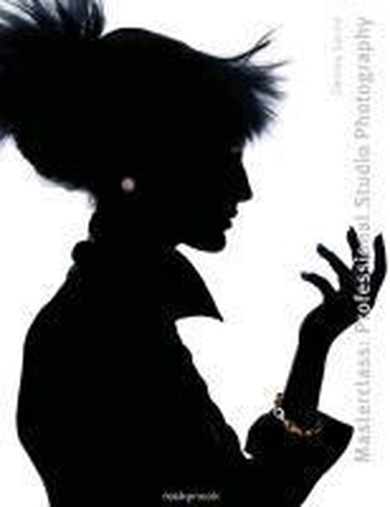
Masterclass Professional Studiophotography:
This book provides a comprehensive workshop on studio photography aimed at aspiring professionals. Richly illustrated, it covers an array of photographic subjects including still life, industry, technology, food, jewelry, portraiture, and more.

Book 'Masterclass Professional Studiophotography:   Masterclass Professional Studiophotography

TRENDS in GRAPHIC DESIGN: 'CITRUS" (UK)


Trends in Graphic Design CITRUS

Citrus, Trends Discussion: (this interview is from the year 2000)

Q: What were significant trends in concepts and visualisation and how different were they in various parts of the world?
A: We have always regarded photography as an integral part of graphic design, rather than a separate entity. It partners traditional, purist 'graphics' by bringing another level of visual dynamics. We cannot explain our design aesthetic: it just happens. We follow our instincts and do not allow fashion to dictate a particular style or direction within our work. We will only fuse photo:graphic techniques into projects if they are appropriate.

In addition to commercial work we produce a self promotional publication called 'ex:haust' because it isn't always possible to do the type of work that you would like within a specified client brief. Ex:haust is our personal visual transmitter which allows us to experiment with concepts, techniques, etc. Having an outlet to do exactly what we want and to be able to show examples of other client work, displayed in a different environment, helps keep us fresh and get our design ethic 'out there'.

Through international outlets we have been fortunate that people in different corners of the globe are prepared to pay for and support what we are doing. We invest a lot of time in getting the package together and people get a little piece of us in return.

Q: It is clear that, in this short time span, both professions have changed tremendously. You will be aware of the enormous possibilities brought by new computer programs, and of the tensions this has caused between designers, digital photographers and printers leaving clients often wondering who is doing what and who is right.
For all these glitches are existing solutions, developed by experts in respective fields and this forms also a part of the trends and way of working.

A: We have witnessed the growth of the Macintosh from the early days, through to the current supercomputing crop and always knew it would prevail as the basis for the profession. However, being exposed to traditional 'hands on' methods of art, design and photography has strengthened our understanding of the physics of design. In the last decade, we have experienced both worlds and this has benefited our working ethos.

Much of our earlier work was created on systems that are almost inconceivable now: the computers weren't powerful, Macs were fairly expensive and exclusive; the software was basic, had glitches and numerous, self-discovered 'trial and error' workarounds. There has been a constant learning curve but it's the anticipation of the unknown that is exciting. Experimentation produces some fantastic results, which if you were trying to create, simply wouldn't happen.

Q: What will the near future bring and what more is there to desire?

A: With the advent of digital cameras, film faces possible extinction. However, the current level of quality just isn't present and there is still something unique and exquisite about the characteristics of film. It is analogous to music, when CDs were to kill off vinyl. There is something quite special about vinyl and the technologically superior 'purity' of CD/digital doesn't actually make the music any better; it's merely an alternative carrier/delivery mechanism for the music. Akin to vinyl, there is a certain warmth to film that is lost within the digital process.

Additionally, software is getting more advanced, even intelligent, but it is still fundamentally the same as it was in the early 90s; a bitmap image is still a construction of pixels, where each pixel's state can be transformed. Although digital is making things easier, quicker, etc., its advance is to the detriment of traditional techniques.

As for future desires, the unofficial Citrus wish list:
'DreamHelmet™': a technology that accurately records thoughts, ideas and dreams VISUALLY, and dumps them to your billion terabyte server, on your wristwatch! The possibilities for creativity and experimentation are phenomenal. However, working on the statistic that guys think about sex every 10 seconds or so, the rest of the day would be wasted editing it!

Some software that has actually been extensively tested to be bug and glitch free before it's released and we are expected to pay for it!
('DreamHelmet™', here we come...)

www.citrus.co.uk
Trends in Graphic Design CITRUS


TRENDS in GRAPHIC DESIGN: ARTGRAFICA (the Netherlands)

What you see is the cover of the ‘Muze van het Museumplein’, a magazine about classical music I design together with Martin van Amerongen. The typography and logo had been established in the first initial design but that is about the only restriction I impose on myself. Per issue there is complete freedom about designing the content. The images are produced as much as possible on commission, either by ourselves or by a third party. This particular image is an example of a unique co-operation between illustrator Carolyn Ridsdale and myself. She is a cartoonist by origin but was fed up with that particular style of working and therefore developed a new way of illustrating. She creates collages of existing photo material from magazines, but goes one step further than cutting parts and putting them together again. All the ‘snippets’ are used as drawing material, you could say like paint. The result is quite daring and very original. On the design you can see a part of an illustration used for the article inside about Wynton Marsalis.

When I hire an illustrator or photographer, he or she should be totally free. At that particular moment, I already have an idea what I am looking for, but I avoid being too explicit. The results of working in this way are quite surprising.
Often photographers and illustrators make more than one proposal and we adapt all this material to get the best possible result. It is more than just reserving a white space to be filled later with a design or photograph.
Exchanging ideas in this way is stimulating and does result in new ways of working.


Why this project" -Robert SCHILDER (the Netherlands)

last | next Why this project? (written in 1994) With this publication, I would like to illustrate the relationship between professional...